16 Sales Dashboard Examples [+ Layout Tips]

Contents
To succeed in 2026, sales teams need data-driven insights to inform their strategy. That’s where a sales dashboard comes in — a powerful sales tool that brings all your important data together in one place. To give you a better idea of how to set up a successful dashboard, we’ve compiled a list of 16 sales dashboard examples below.
Plus, keep reading for tips on how to create a sales dashboard, layout considerations, and ways to use the data to reach goals and celebrate wins.
What Is a Sales Dashboard?
A sales dashboard is a tool that visualizes sales data in an easily digestible way. It’s intended to help sales managers and reps see their performance metrics such as conversion rates, sales to date, sales growth and more. Higher-level executives can also use sales dashboards to keep tabs on the sales team. It should be simple to read and make it easy for teams to create actionable reports.
Why Do You Need a Sales Dashboard?
Sales dashboards help sales representatives see how well they are progressing toward personal goals.
Sales development reps can use dashboards to view their performance and quotas. Sales managers use them to keep track of their team members’ performance. Sales team leaders can glean valuable information and actionable insights from sales dashboard data.
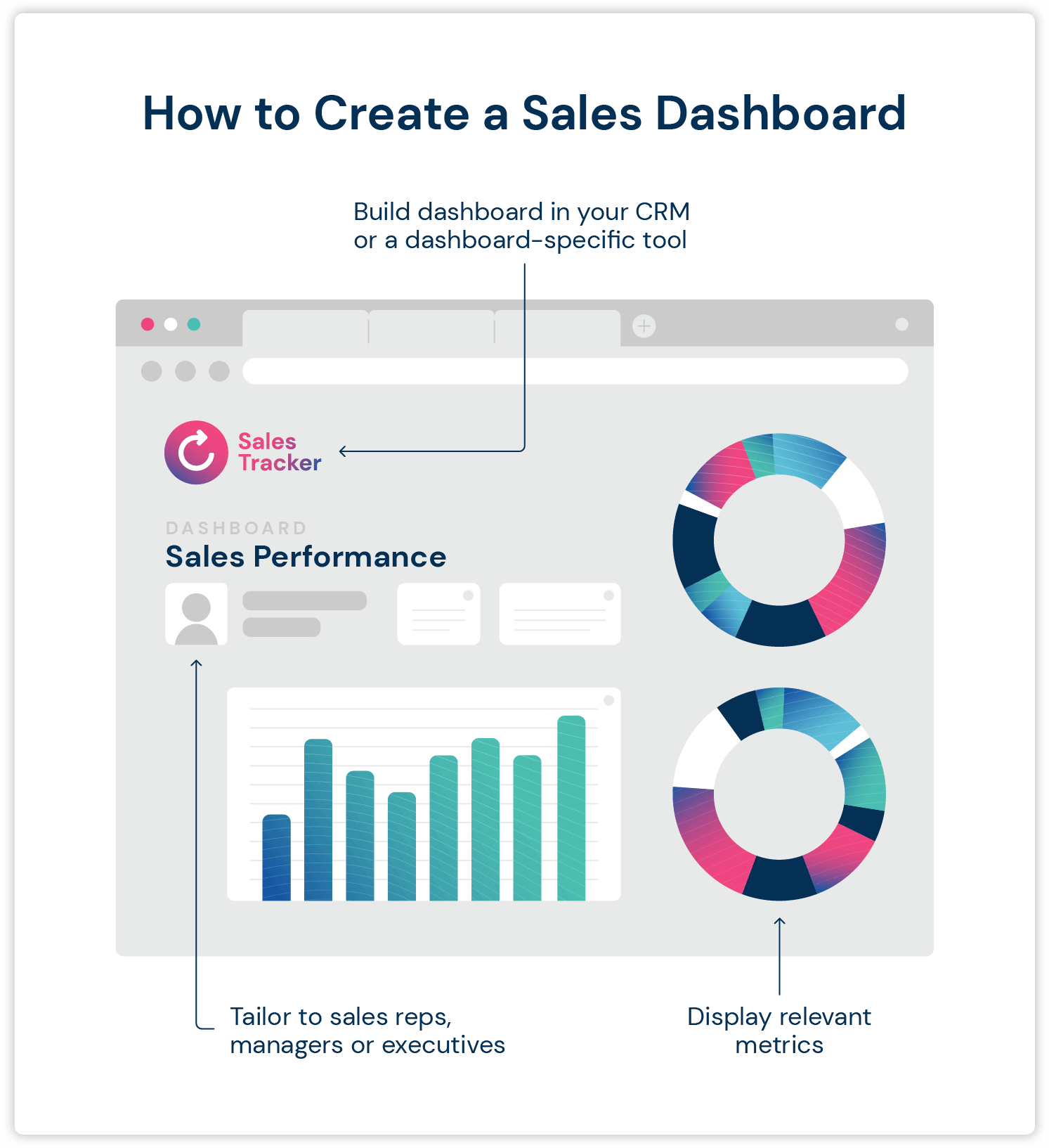
How To Create a Sales Dashboard
There are lots of different types of sales dashboards, and yours will ultimately need to reflect your team’s specific needs. But to help you narrow down your options, here are some steps to get started with your sales dashboard.
Decide on Metrics
First, take a look at your sales goals and highest priorities. Say you want to view sales metrics like revenue or quarter-over-quarter growth. You can build a dashboard that focuses on those higher-level metrics. Or, if you want to gain insights on the strengths and productivity of individual team members, you can build a time-tracking or leaderboard dashboard. Evaluate your goals and decide which KPIs you want to focus on to pin down your main purpose of the dashboard.
Know Who Will Be Using the Dashboard
Decide who will be viewing the dashboard and how often. A dashboard for sales reps and managers to monitor daily progress will look different from one intended for VPs and stakeholders to view high-level data every few weeks.
Find a Sales Dashboard Platform
Next you need to find a platform. It’s likely that you can build a sales dashboard in a sales tool that your team is already using, like your CRM or sales engagement platform. For example, you can create a helpful dashboard of your outbound metrics in Mailshake.
You can build a dashboard in your existing tools or, as your sales team matures and depending on your needs, you can migrate to dashboard-specific tools.
Pull Your Data Together
If you select a new software, you can then pull in your desired data from your CRM. Many tools will make this painless by integrating with your existing software. If you don’t use a CRM, however, you may need to manually pull data from spreadsheets into the dashboard.
The dashboard will organize your data into easier-to-understand graphs, charts, and other data visualizations. Most dashboards are also customizable to allow you to sort the data how you’d like and organize sections by what’s most relevant to your team.
Create Sales Reports
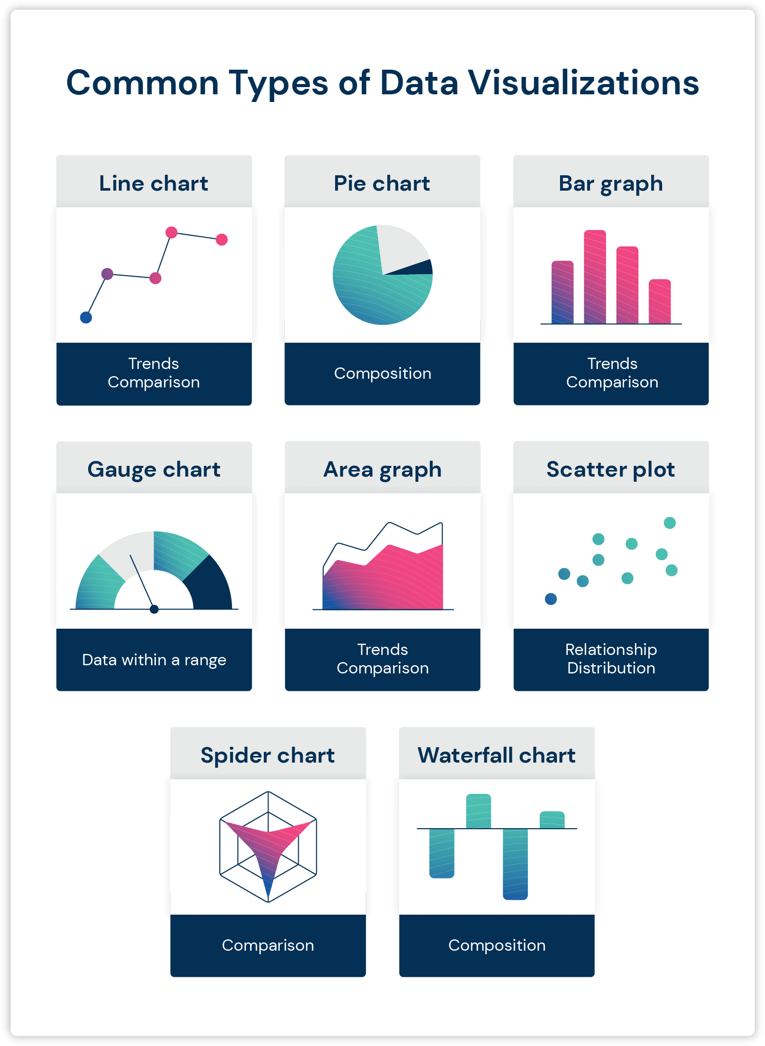
Once you have your dashboard set up, train your team on how to use it and create reports. Sales dashboards usually have features that let you visualize the data in different ways and customize your reports.
Here’s a quick reference guide to various charts and visualizations that you may use in a sales dashboard and in your reports:
Sales Dashboard Examples
Here you can find 16 sales dashboard examples. Scroll through to discover the KPIs and metrics they can track, who each dashboard is for and the specific purpose of each.
1. Sales Engagement Dashboard
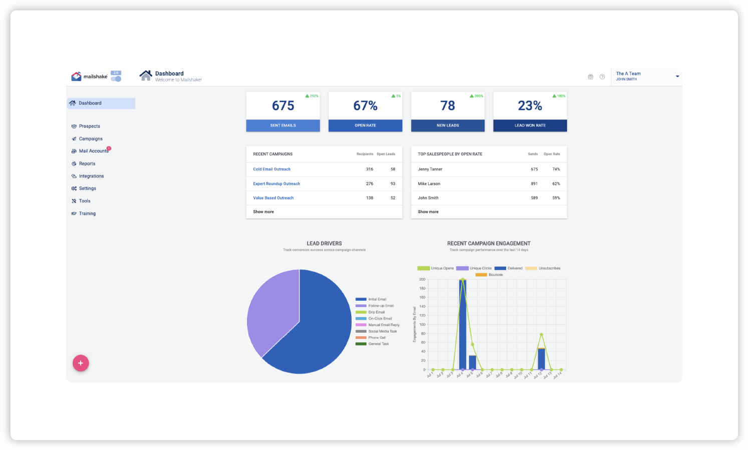
- Example: Mailshake
- KPIs and metrics: Sent emails, open rate, new leads, lead won rate, top salespeople by open rate, lead drivers, campaign engagement
- Who it’s for: Sales leaders, sales teams
A sales engagement dashboard helps sales leaders track their team’s outbound metrics, monitor outreach campaigns, track conversion success across campaign channels, and keep an eye on engagement. Our sales engagement software helps automate your team’s sales outreach and gain insight into all lead activity through a comprehensive yet easy to use dashboard.
2. Sales Manager Dashboard
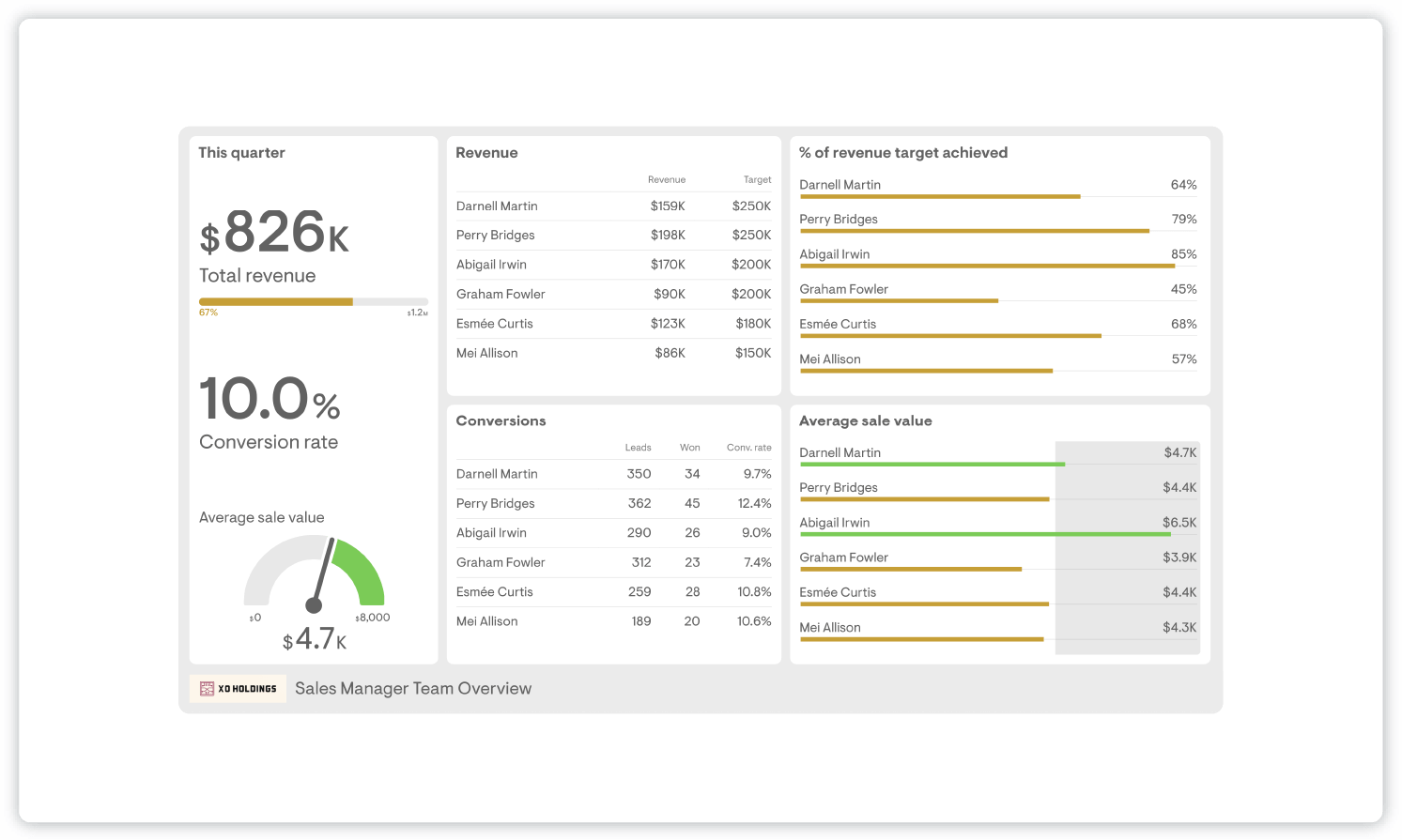
- Example: Geckoboard
- KPIs and metrics: Revenue, conversion rate, average sale value by sales rep, percent of revenue target achieved by sales rep
- Who it’s for: Sales managers
A sales management dashboard focuses on team performance and improvements. This example gives the sales manager an overview of each team member’s performance and progress toward overall team goals. They can create benchmarks for average sale value and monitor how each sales rep is doing.
3. Sales Leaderboard
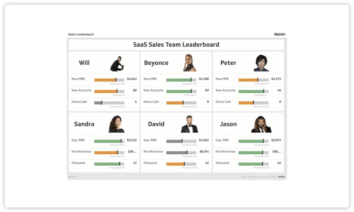
- Example: Klipfolio
- KPIs and metrics: New MRR (revenue from new business deals each month), new customers, new accounts acquired, demos, retention rate, number of onboarding calls per sales rep
- Who it’s for: Sales managers, sales reps
A sales leaderboard dashboard allows managers to track each individual’s sales performance as well as see overall team performance. When viewed by sales reps, a leaderboard can encourage friendly competition, motivate the team and help track goals. The team can easily see who is excelling and who is falling behind on a daily, weekly and monthly basis.
4. Sales Performance Dashboard
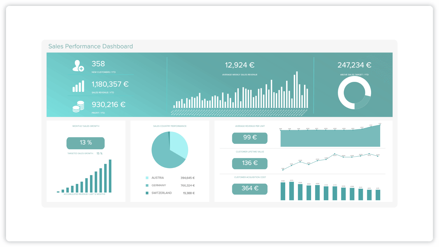
- Example: Datapine
- KPIs and metrics: Sales growth, sales targets, ARPU, acquisition costs, CLV
- Who it’s for: Sales managers
This sales performance dashboard gives managers a bird’s-eye view of the sales department’s progress in terms of growth and progress toward sales targets. It gives a complete at-a-glance picture of sales performance. You can see if your individual sales reps and team are on track to meet goals and create valuable sales reports.
5. Sales Productivity Dashboard
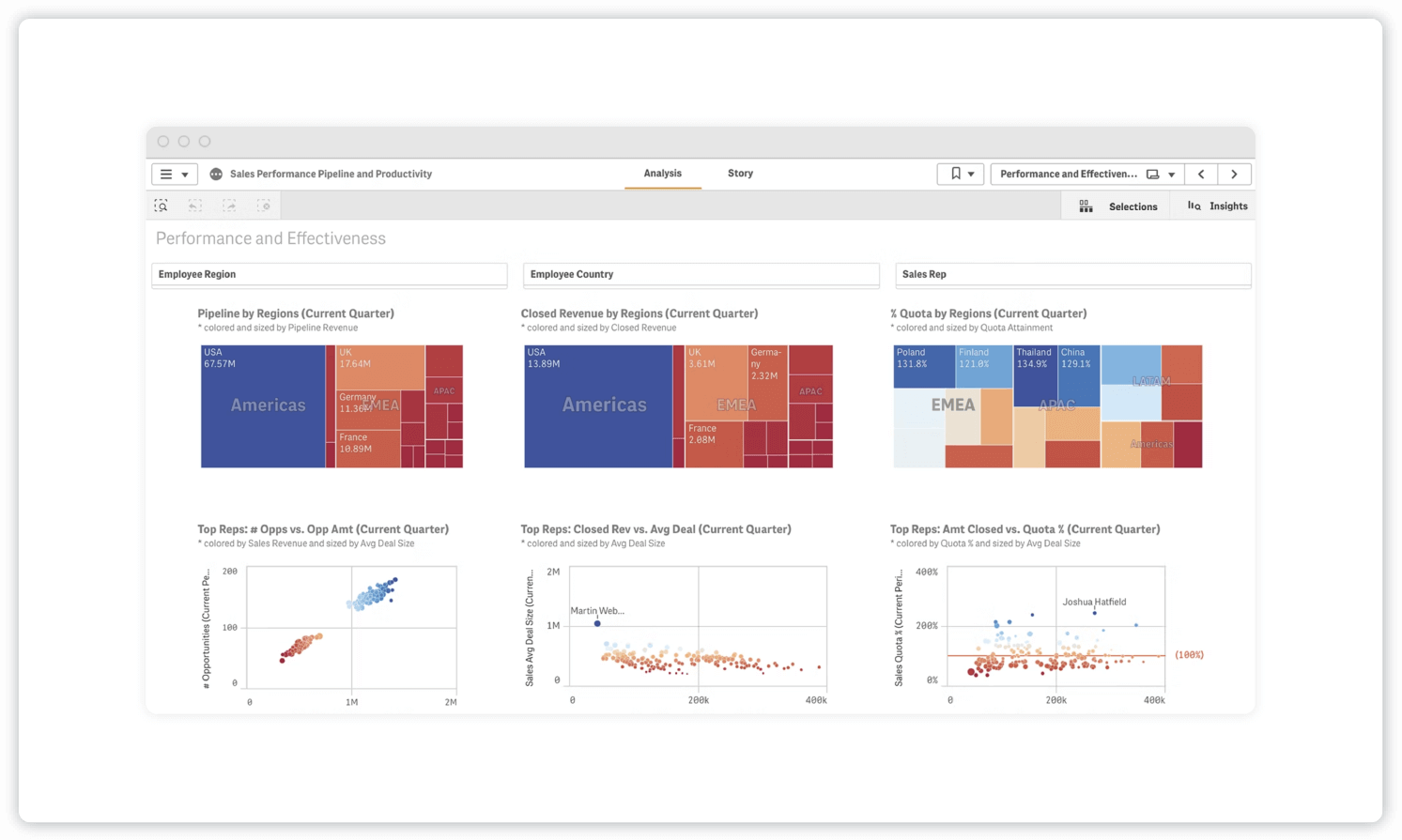
- Example: Qlik
- KPIs and metrics: Pipeline by regions, closed revenue by regions, percent of quota by regions, top reps
- Who it’s for: Sales executives
This sales performance and productivity dashboard gives sales executives a high-level overview of the sales pipeline. They can also zoom in to focus on individual team performance through this one convenient view.
6. Conversion Dashboard
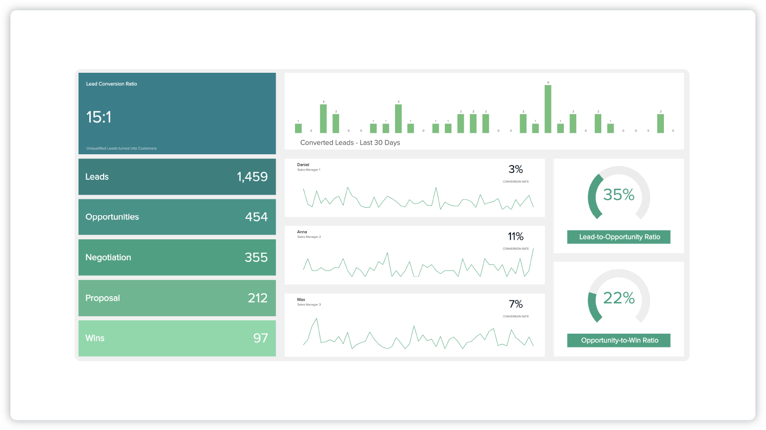
- Example: Datapine
- KPIs and metrics: Lead-to-opportunity ratio, opportunity-to-win ratio, lead conversion rate
- Who it’s for: Sales managers
This sales conversion dashboard takes a deep dive into the individual stages of the sales cycle with the goal of improving conversion rate. By letting you view the lead-to-opportunity ratio and opportunity-to-win ratio, this dashboard can help determine where in the sales cycle your team is excelling and where they could use improvement.
7. Sales Cycle Length Dashboard
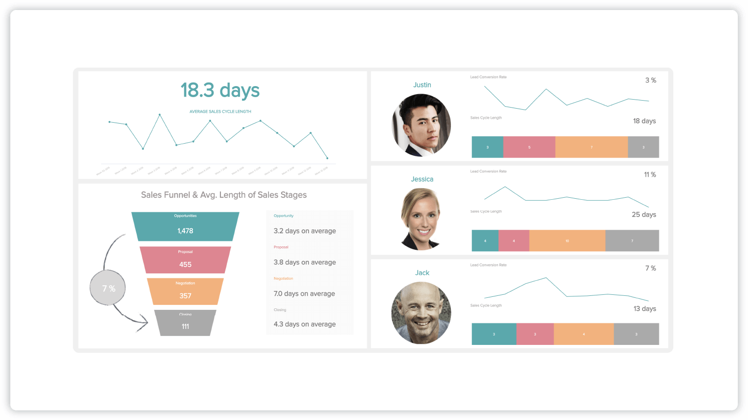
- Example: Datapine
- KPIs and metrics: Average sales cycle length, lead conversion rate
- Who it’s for: Sales managers
A sales cycle length dashboard like this one can help managers thoroughly understand their sales cycle length and work toward optimizing it. You can view the average length of sales stages across all your sales reps and use that data to improve team productivity and shorten the sales cycle.
8. Win-loss Dashboard
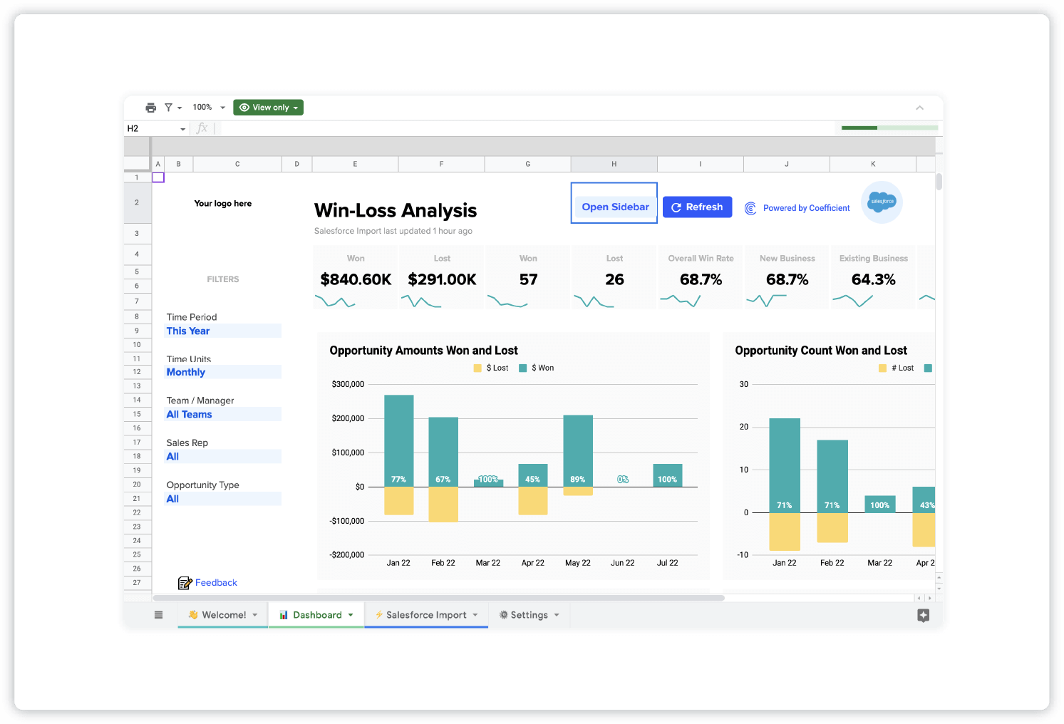
- Example: Coefficient
- KPIs and metrics: Win rate, loss rate, opportunities won and lost
- Who it’s for: Sales teams
A win-loss dashboard lets teams view how win rates (team and individual) rise and fall over time, helps pinpoint performance trends and helps make plans to increase wins and cut losses.
9. Sales Activities Dashboard
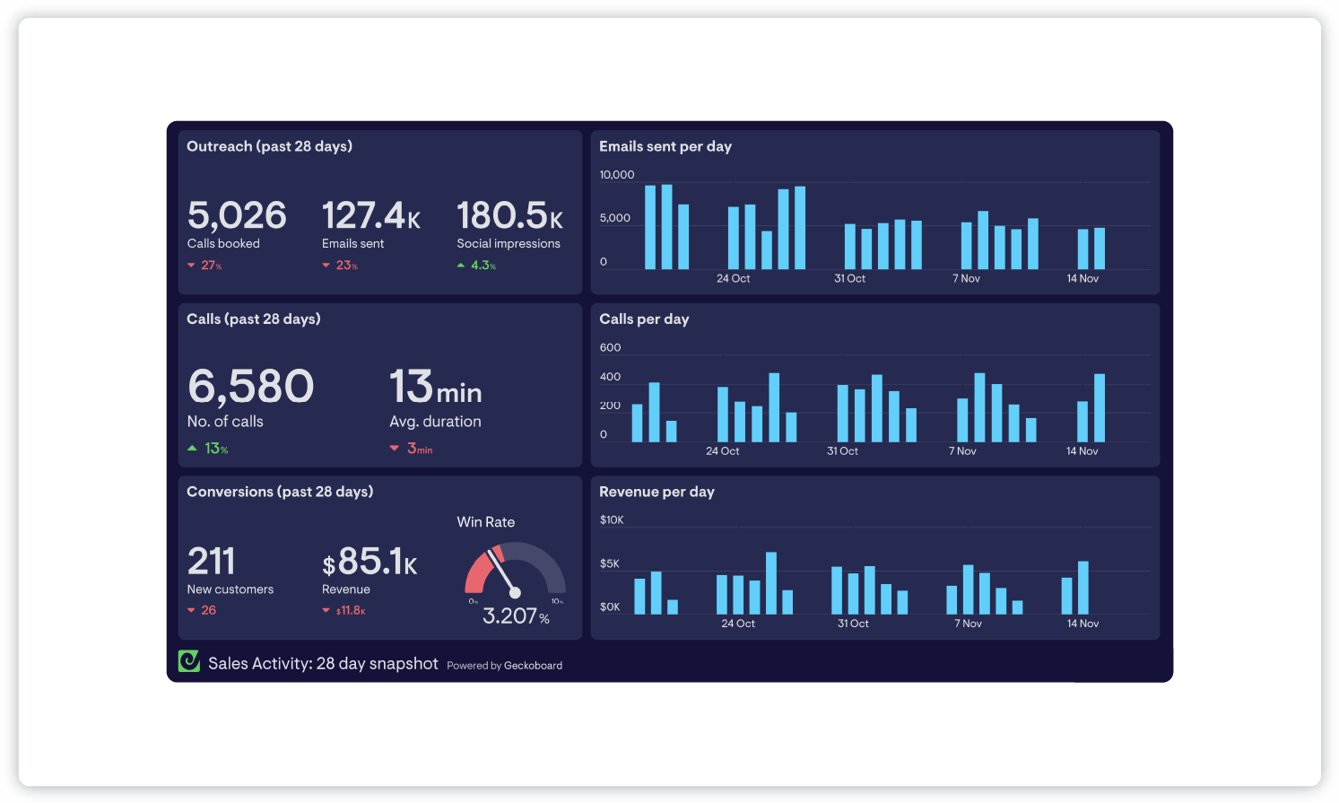
- Example: Geckoboard
- KPIs and metrics: Calls, emails, conversions, revenue per day
- Who it’s for: Sales managers, sales teams
This dashboard allows you to track sales activities across your team for the past 28 days. You can see how many calls are completed, the duration of those calls, how many emails are sent and conversions, alongside revenue fluctuations to check in on the effectiveness of outreach efforts.
10. Time-tracking Dashboard
![]()
- Example: Databox
- KPIs and metrics: Hours tracked, billable hours, time report based on projects, tasks, clients, etc.
- Who it’s for: Sales managers
A time-tracking dashboard lets employees track their activities across the workday. Managers can then get an informed view of how sales team members are spending their time, the projects they are spending the most time on and tasks that may require more or less time. They can then identify bottlenecks in productivity and make changes to improve operations.
11. Sales Opportunity Dashboard
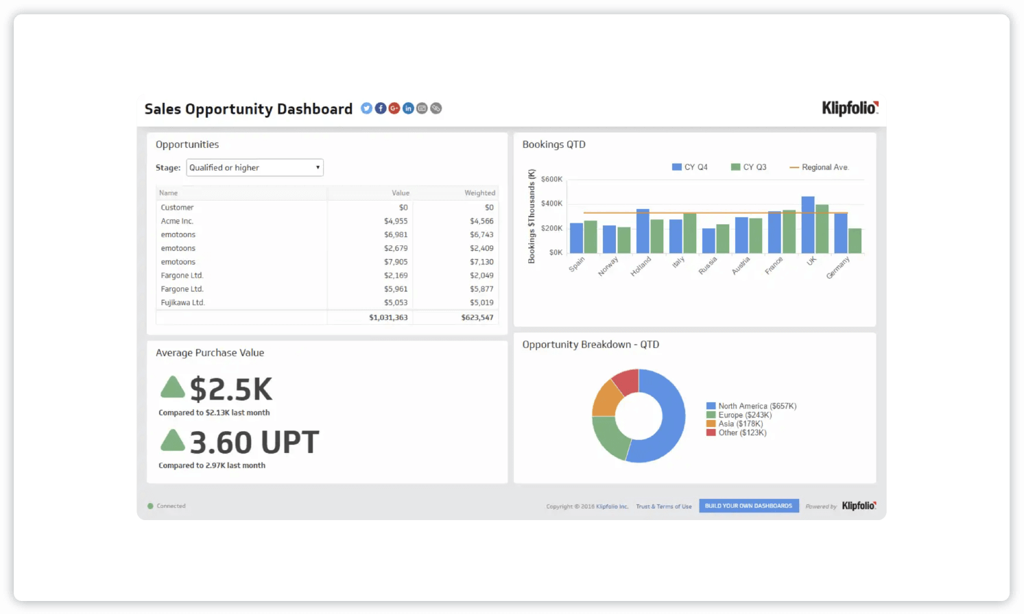
- Example: Klipfolio
- KPIs and metrics: Sales bookings, sales opportunities, average purchase value, units per transaction, opportunity breakdown by region
- Who it’s for: Sales managers
This sales opportunity dashboard illuminates future opportunities in the sales pipeline. It shows where the best opportunities are and what stage they’re in. The dashboard uses sales data to sort opportunities by region, stages and average value of each purchase.
12. Deal Performance Dashboard
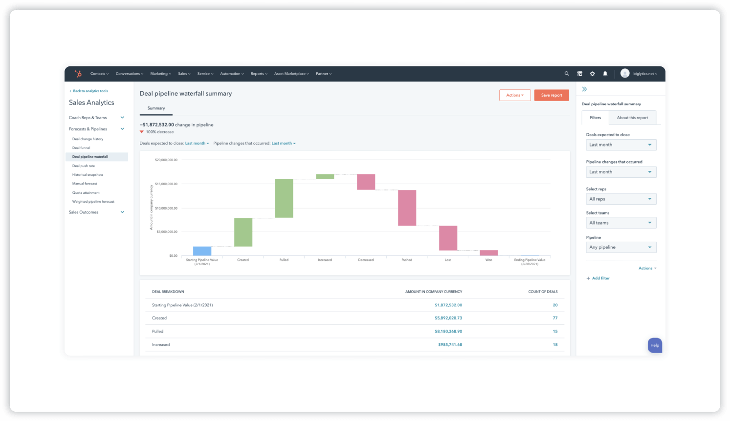
- Example: HubSpot
- KPIs and metrics: Deals expected to close, pipeline changes
- Who it’s for: Sales teams
A deal performance dashboard like this one allows your team to see deals that are expected to close. You can also view things like deals in the pipeline, newly created deals and pipeline changes that have occurred within various time periods.
13. Sales Product Performance Dashboard
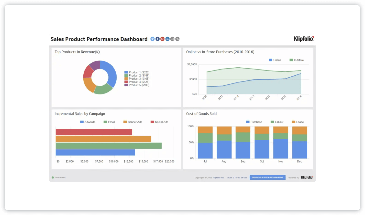
- Example: Klipfolio
- KPIs and metrics: Product performance, incremental sales, point of purchase, cost of goods sold
- Who it’s for: Sales teams
This sales product performance dashboard visualizes the performance of various products and campaigns. The dashboard shows what products are bringing in the most revenue, as well as things like online vs. in-store purchases to help your team make any needed adjustments to meet goals.
14. Sales by Region Dashboard
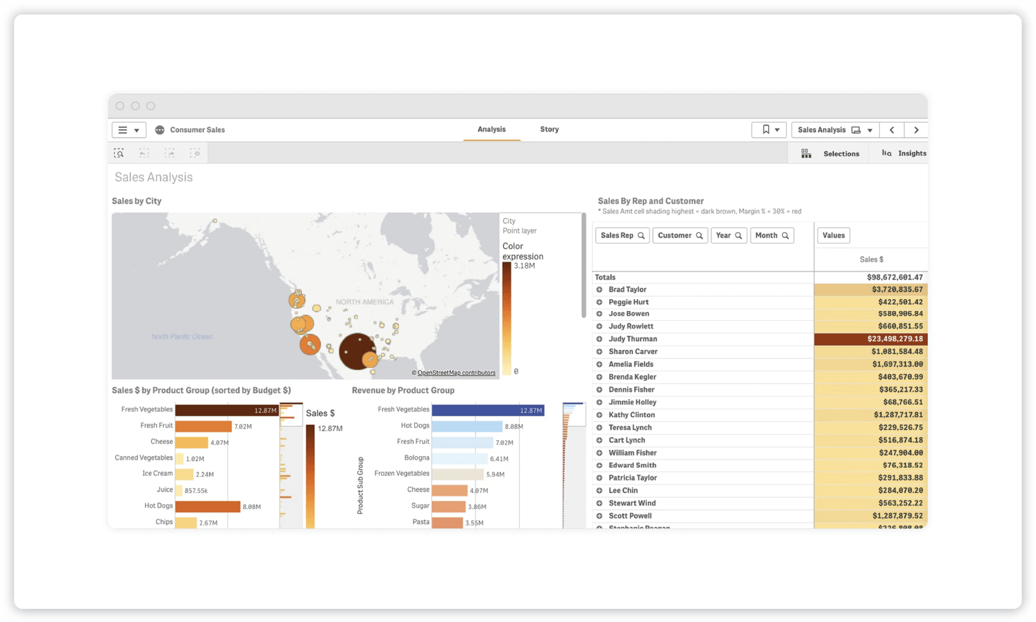
- Example: Qlik
- KPIs and metrics: Sales by city, sales by rep and customer, sales by product group, revenue by product group
- Who it’s for: Sales managers
A sales by region dashboard is a useful tool to check out revenue and sales by city, region and product type. This one also allows you to view sales by rep and customer.
15. Sales Pipeline Dashboard

- Example: Tableau
- KPIs and metrics: Pipeline by opportunity stages, pipeline by opportunity size buckets, pipeline by sales rep, timeline of deals, custom KPIs
- Who it’s for: Sales managers, executives, sales analysts
It’s important to keep a pulse on your sales pipeline, and this sales pipeline dashboard helps managers and executives do just that. It provides a detailed look at the status of your pipeline, letting decision-makers see where leads are coming from and make necessary adjustments to take advantage of opportunities and meet quota.
16. Sales KPI Dashboard
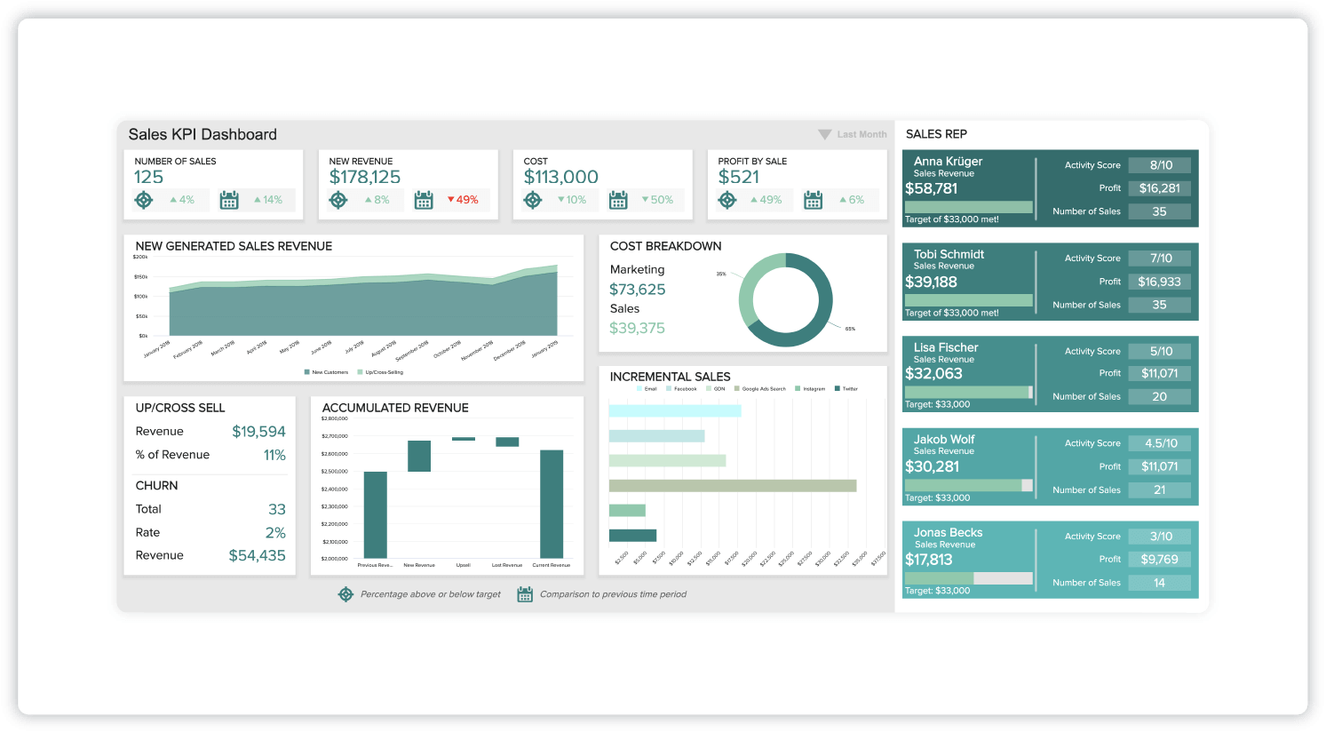
- Example: Datapine
- KPIs and metrics: Revenue per sales rep, customer churn rate, upsell & cross-sell rates, profit margin per sales rep, incremental sales by campaign
- Who it’s for: Sales managers, sales VPs, C-level executives
This sales KPI dashboard breaks down high-level metrics for decision-makers to keep tabs on performance and sales goals. You can compare targets against the previous month to inform strategy and pinpoint adjustments.
Sales Dashboard Tips
Now we’ll cover a few pointers on how to set up and get the most out of your sales dashboard.
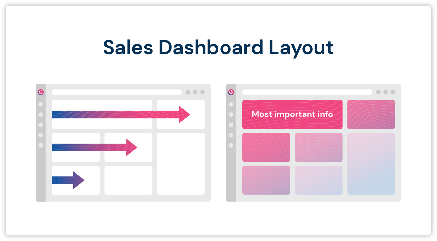
Consider the Layout
You don’t need to be a graphic designer to create a visually pleasing and effective dashboard layout. Here are some layout tips to keep in mind:
- Only include relevant info. Reduce unnecessary visual noise where possible and keep things simple.
- Group related graphs and metrics. This will help tell a clear story and simplify complex data.
- Put the most important information in the top left. Just like reading a book, our eyes are automatically drawn to the top left of the screen first.
- Use visual hierarchy. Make more important information large and front and center.
Embrace Transparency
The transparency of sales dashboards can help get your team members on the same page. Allowing individual team members as well as management to share data can motivate your sales reps, foster collaboration and make all team members more accountable. Team members will be able to see and be proud of the impact they’re making.
Use the Data To Celebrate Wins
Use your sales dashboard as a tool in a goal-oriented plan. Visualizing the data in a digestible way makes it easier to propel your team toward its goals. It also makes it easier to recognize wins, both big and small. Use the dashboard to celebrate successes, like exceeding quota, and make important improvements across the team.
Continue evolving your sales dashboard to reflect your team’s changing goals. To level up your sales engagement strategy even further, check out Mailshake. Our powerful sales engagement software can help your team connect with more prospects, book more meetings and generate more sales — and manage it all from one central dashboard.


Continue reading


Social
![]()
![]()
![]()